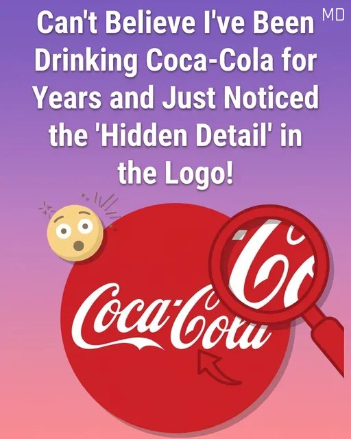
The “Hidden Smile” in the Coca-Cola Logo: Design or Perception?
Have you ever looked at the iconic Coca-Cola script and noticed something familiar—not just letters, but a friendly expression? Many people have begun to point out a subtle “smile” tucked into the second “C” of the word “Cola.” This observation highlights the fascinating intersection of historical design and human psychology.
🖋️ Origins: The Spencerian Script
The Coca-Cola logo was created in the 1880s by Frank Mason Robinson, the bookkeeper for the brand’s founder.
- The Style: Robinson used Spencerian script, a form of elegant penmanship that was the standard for business communication in the late 19th century.
- The Intent: Historical records suggest the goal was purely aesthetic—creating a balanced, refined, and distinctive look that would stand out on pharmacy signs.
- The “Smile”: There is no historical evidence that Robinson intentionally hid a smile in the lettering. The flourish was simply a characteristic of the decorative handwriting style of that era.